Brand identity lives or dies in the details — the exact shade of blue in your header, the weight of your hero typeface, the way accent colours ripple through buttons and links. If you have been manually hunting through stylesheet after stylesheet to change a single hex value, there is a faster and more reliable path. The Canvas HTML Template ships with Canvas Builder, a visual theming panel that lets you customise colours, fonts, and layout preferences directly in the browser, then export a production-ready configuration in seconds.
Key Takeaways
- Canvas Builder is the built-in visual theme editor included with every Canvas Template purchase.
- Colour changes are powered by CSS custom properties (
--cnvs-themecolorand related variables), making overrides clean and non-destructive. - Google Fonts and custom web fonts can be applied globally without touching a single line of CSS.
- Exported settings generate a
canvas-builder.cssoverride file that sits on top of the core stylesheet, preserving future upgrade paths. - Understanding the variable hierarchy lets you go beyond the panel for granular, code-level theming.
What Is Canvas Builder and How Does It Fit Into the Workflow
Canvas Builder is a browser-based configuration panel bundled inside the Canvas Template package. When you open a Canvas demo page locally or on a staging server, a floating trigger button activates the panel on the right side of the viewport. From there you can adjust the primary theme colour, link colour, body font, heading font, font sizes, header style, and several layout switches — all with live preview.
The panel does not rewrite your source files directly. Instead, it compiles your selections into a block of CSS variable overrides and, on export, writes them to a standalone file. This approach respects the separation of concerns principle: the core style.css remains untouched, and your brand-specific overrides live in one predictable location. When a new Canvas release ships with updated base styles, you merge only the core file, not the entire stylesheet.
Customising the Primary Theme Colour
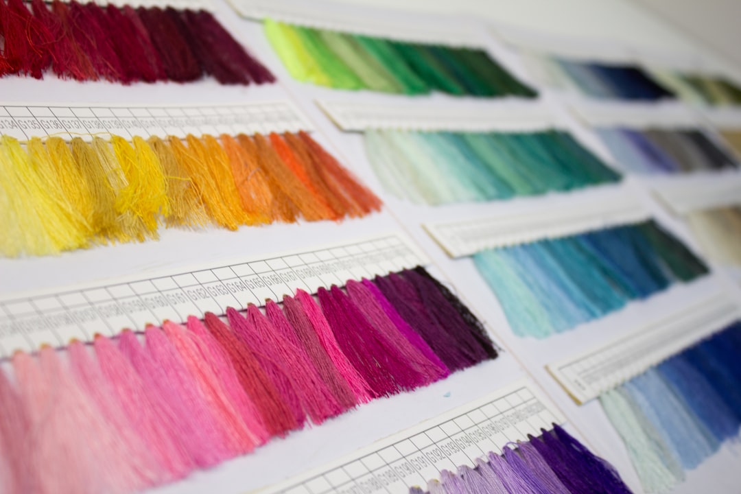
The most common customisation task is replacing Canvas’s default teal accent with a brand colour. In Canvas Builder, open the Theme Color swatch picker and either enter a hex value directly or use the colour wheel. The preview updates every component that references --cnvs-themecolor — buttons, active nav links, section dividers, icon colours, and more — giving you an honest read of how the colour scales across the page.
Under the hood, every change you make in the panel maps to a CSS custom property. The primary variable is:
:root {
  --cnvs-themecolor: #1ABC9C;          / primary brand colour   /
  --cnvs-themecolor-rgb: 26, 188, 156; / RGB version for rgba() /
  --cnvs-themecolor-hover: #16A085;    / derived hover state     /
}If you need a colour that Canvas Builder’s picker cannot express accurately — for instance, a specific Pantone conversion — you can edit these three variables directly in the exported override file. Keeping the -rgb variant in sync is important because Canvas uses it for translucent backgrounds: rgba(var(--cnvs-themecolor-rgb), 0.15) is a pattern you will find throughout the component library.
For projects with multiple brand colours (primary, secondary, tertiary), consider declaring additional custom properties in your override file alongside the Canvas variables. This keeps everything in one place and makes handoff to other developers straightforward. If you are building a multi-section site, the techniques in Build an Event Website with the Canvas Event Demo show how colour theming interacts with full-page section layouts.
Setting Global Fonts Through Canvas Builder
Typography is the second pillar of visual brand identity, and Canvas Builder handles it without requiring any manual <link> tags or @import statements. Inside the Typography panel you will find two separate font selectors: one for body text and one for headings. Both pull from the full Google Fonts catalogue.
Select your heading font, choose a weight (400, 600, 700, or 800 are the most useful), and the preview renders live. The exported override file appends the correct Google Fonts URL to the <head> and sets the relevant CSS variable:
/ Auto-generated by Canvas Builder export /
:root {
  --cnvs-body-font: 'Inter', sans-serif;
  --cnvs-heading-font: 'Sora', sans-serif;
  --cnvs-heading-font-weight: 700;
}

/ Google Fonts import added to  by export /
<link rel="preconnect" href="https://fonts.googleapis.com">
<link rel="preconnect" href="https://fonts.gstatic.com" crossorigin>
<link href="https://fonts.googleapis.com/css2?family=Inter:wght@400;500&family=Sora:wght@700&display=swap" rel="stylesheet">If you need a self-hosted font instead of Google Fonts — a common requirement for GDPR compliance or performance audits — use the same CSS variable in your override file but point it at a locally loaded @font-face declaration. Canvas Builder’s export gives you the variable name; swapping the source is a one-line change.
Font size scaling follows Bootstrap 5’s font-size-root pattern. Canvas exposes --cnvs-body-font-size and a heading scale. Nudging the base size up or down (commonly between 15 px and 17 px) has a proportional effect across every component because heading sizes use em or rem units throughout.
Header Styles, Spacing, and Layout Switches
Beyond colour and typography, Canvas Builder surfaces several structural toggles that affect the overall page architecture:
- Header style — choose between transparent-on-hero, sticky, or static positioning, with separate colour variants for light and dark modes.
- Section padding — a global padding multiplier that scales
--cnvs-section-paddingup or down, useful for dense landing pages versus spacious marketing sites. - Smooth scroll — enables or disables the native CSS
scroll-behavior: smoothdeclaration. - Dark mode default — sets the initial colour scheme before any user preference detection runs.
Each of these maps to a CSS variable or a data-* attribute on the <body> element. The export file captures both, so your chosen layout state is baked in from the first page load rather than applied by JavaScript after render — a meaningful improvement for Cumulative Layout Shift (CLS) scores.
Exporting Your Theme and Integrating It Into a Project
When you are satisfied with the preview, click Export in Canvas Builder. The panel generates two outputs:
- A
canvas-builder.cssfile containing all your CSS variable overrides. - A snippet of
<head>HTML with the correct font imports and any<body>attribute additions.
Place canvas-builder.css in your project’s /css/ folder and reference it after the core Canvas stylesheet in every page <head>:
<!-- Core Canvas styles -->
<link rel="stylesheet" href="css/style.css">

<!-- Your Canvas Builder theme overrides (generated) -->
<link rel="stylesheet" href="css/canvas-builder.css">This load order is critical. If your override file loads before the core stylesheet, the cascade will not work correctly because core rules will overwrite your custom properties rather than inherit them. Keeping overrides last also means future Canvas updates never erase your brand customisations.
For teams deploying to static hosting, this single file is all that needs to be version-controlled and deployed alongside the rest of the template assets. The process fits neatly into the workflow described in How to Host a Bootstrap HTML Template for Free in 2026, where lightweight asset footprints keep build and deploy times short.
Going Beyond Canvas Builder: Manual CSS Variable Overrides
Canvas Builder covers the most common theming needs, but production projects often require finer control. Because the entire system is CSS custom property–based, any variable can be overridden in canvas-builder.css without touching core files. Some useful targets not exposed in the panel UI include:
--cnvs-border-radius— controls the global border-radius for cards, buttons, and form inputs simultaneously.--cnvs-transition— the default easing and duration applied to hover states across interactive elements.--cnvs-heading-letter-spacing— tighten or loosen heading tracking to match editorial brand guidelines.--cnvs-contrast-bg— the background colour used by contrast sections, which can differ from the primary theme colour.
A practical approach is to run a quick search for var(--cnvs- in the core style.css to discover the complete variable catalogue. Cross-referencing this with the Bootstrap 5 Utility Classes cheat sheet will show where Bootstrap’s own variables end and Canvas’s layer begins, which prevents you from accidentally overriding a Bootstrap token when you intend to target a Canvas component.
Frequently Asked Questions
Canvas Builder is available across all Canvas Template demos. Because every demo inherits from the same CSS variable system, a theme exported from one demo can be applied to any other by placing the canvas-builder.css override file in the project and adjusting any demo-specific component colours as needed.
Yes, provided you keep the override file separate from core Canvas files. The recommended workflow — placing your overrides in canvas-builder.css and loading it after style.css — means you only need to replace the core stylesheet when updating, leaving your customisations intact.
Absolutely. Add a @font-face declaration for your self-hosted font files in canvas-builder.css, then assign the font family name to --cnvs-body-font or --cnvs-heading-font. Canvas Builder handles the variable assignment; you supply the font source.
Canvas variables wrap Bootstrap variables in many places. For example, --cnvs-themecolor feeds into Bootstrap’s --bs-primary where appropriate. In practice this means changing one Canvas variable can update both Canvas components and native Bootstrap components simultaneously, reducing the number of overrides you need to write.
The performance impact of CSS custom properties is negligible in modern browsers. The single additional stylesheet (canvas-builder.css) is typically under 2 KB and can be inlined or combined with other overrides during a build step if you are optimising for the fastest possible load times.
Looking for a production-ready Bootstrap 5 HTML template? Browse Canvas Template demos and find the perfect starting point for your next project.
If you’re building with the Canvas HTML Template and want to ship production-ready Bootstrap 5 layouts faster, try Canvas Builder free — the visual builder that exports clean Canvas-ready markup in minutes.
Skip the setup — build it free
Spin up a complete Bootstrap 5 site, blog included, with Canvas Builder. No coding, no cost.
Canvas Team
Tutorials and tips for building beautiful Bootstrap 5 websites with the Canvas HTML Template and Canvas Builder.
More from the Canvas Blog