

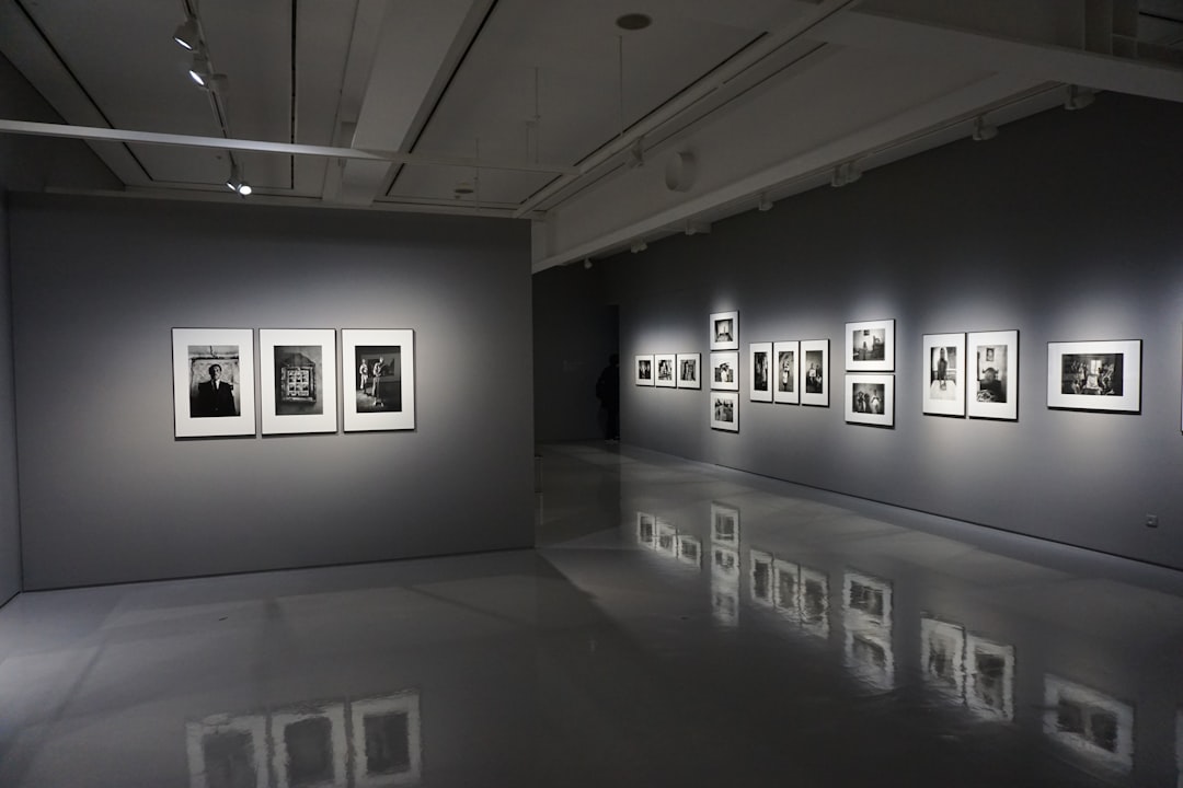
Bootstrap 5 gallery layouts that photographers, creative agencies, and marketing teams can implement today, each with honest notes on when to use it, when to avoid it, and working code to get started.
Key Takeaways
- Bootstrap 5’s grid, CSS columns, and Masonry integration each suit different content types — mixing them up causes layout and performance problems.
- Lightbox behaviour, lazy loading, and ARIA labels are not optional extras; they directly affect conversions and accessibility compliance.
- CSS custom properties (e.g.
--cnvs-themecolorin Canvas HTML Template) let you retheme gallery overlays and captions without touching component-level CSS. - Masonry is visually compelling but adds JavaScript overhead — benchmark before defaulting to it.
- Filtering (isotope-style) works best with fewer than 200 items; beyond that, server-side pagination is a better user experience.
1. Equal-Cell Photo Grid (Bootstrap Grid)
The simplest photo grid Bootstrap approach uses row-cols-* to force equal-width, equal-height cards. It is the right choice for product catalogues, team headshots, and any context where visual consistency matters more than preserving aspect ratio.
<div class="row row-cols-1 row-cols-sm-2 row-cols-lg-3 g-3">
  <div class="col">
    <a href="photo-full.jpg" data-lightbox="gallery">
      <img src="photo-thumb.jpg"
           class="img-fluid rounded w-100"
           style="object-fit:cover; height:260px;"
           alt="Landscape at dusk, Lake District"
           loading="lazy">
    </a>
  </div>
  <!-- repeat .col items -->
</div>When to avoid it: portrait-oriented photography — object-fit:cover crops faces and focal points unpredictably unless you control the crop server-side first.

2. Masonry (Variable-Height) Gallery
Masonry preserves each image’s natural aspect ratio by stacking items in columns without forced row heights. Bootstrap 5 ships a lightweight native Masonry mode that activates via data-masonry, removing the dependency on the full Masonry.js library for basic cases.
<div class="row g-3" data-masonry='{"percentPosition": true}'>
  <div class="col-sm-6 col-lg-4">
    <img src="portrait.jpg" class="img-fluid rounded" alt="Studio portrait, natural light" loading="lazy">
  </div>
  <div class="col-sm-6 col-lg-4">
    <img src="landscape.jpg" class="img-fluid rounded" alt="Aerial coastline, Cornwall" loading="lazy">
  </div>
  <!-- more cols -->
</div>
<!-- Bootstrap 5 Masonry requires Masonry.js loaded separately -->
<script src="https://cdn.jsdelivr.net/npm/masonry-layout@4/dist/masonry.pkgd.min.js"></script>Trade-off: Masonry.js (28 kB minified) triggers a layout recalculation after images load. Add imagesLoaded alongside it to prevent column-overlap bugs on slow connections.
3. Pure CSS Columns Gallery
The CSS columns property achieves a masonry-like look with zero JavaScript. Browser support is excellent (Chrome 1+, Firefox 1.5+, Safari 3+). The downside is that items flow top-to-bottom within each column, not left-to-right across the row — which can disorient users who expect chronological order.
<style>
  .css-gallery {
    columns: 3 220px;
    column-gap: 1rem;
  }
  .css-gallery img {
    width: 100%;
    margin-bottom: 1rem;
    border-radius: 0.375rem;
    display: block;
    break-inside: avoid;
  }
</style>

<div class="css-gallery">
  <img src="img1.jpg" alt="Wedding reception, candid" loading="lazy">
  <img src="img2.jpg" alt="Bridal detail, floral arrangement" loading="lazy">
  <!-- more images -->
</div>
4. Filterable Portfolio Gallery
Category filtering — “All / Architecture / People / Nature” — is a staple of agency portfolio pages. Isotope.js paired with Bootstrap’s grid is the most widely documented approach. Each item carries a data-filter attribute; buttons toggle which items are visible.
<div class="d-flex gap-2 mb-4">
  <button class="btn btn-outline-dark active" data-filter="*">All</button>
  <button class="btn btn-outline-dark" data-filter=".architecture">Architecture</button>
  <button class="btn btn-outline-dark" data-filter=".people">People</button>
</div>

<div class="row g-3 js-isotope">
  <div class="col-6 col-lg-4 architecture">
    <img src="arch1.jpg" class="img-fluid rounded" alt="Brutalist facade, Birmingham" loading="lazy">
  </div>
  <div class="col-6 col-lg-4 people">
    <img src="people1.jpg" class="img-fluid rounded" alt="Corporate headshot, natural light" loading="lazy">
  </div>
</div>Keep filter categories to six or fewer. More than that and the UI becomes its own navigation problem.
5. Hover-Overlay Caption Gallery
An overlay that reveals a title and icon on hover increases click-through into lightboxes or project pages. This pattern suits agencies showcasing named case studies more than it suits photographers displaying raw work. Use position-relative and Bootstrap’s position-absolute utilities to avoid inline CSS.
<div class="row row-cols-1 row-cols-md-3 g-3">
  <div class="col">
    <div class="position-relative overflow-hidden rounded">
      <img src="project.jpg" class="img-fluid w-100"
           style="object-fit:cover; height:280px;"
           alt="Brand identity project, Fintech startup" loading="lazy">
      <div class="position-absolute top-0 start-0 w-100 h-100 d-flex flex-column
                  justify-content-end p-3 text-white
                  bg-dark bg-opacity-50 opacity-0 hover-show">
        <h5 class="mb-1">Fintech Rebrand</h5>
        <small>Brand Identity · 2024</small>
      </div>
    </div>
  </div>
</div>

<style>
  .overflow-hidden:hover .hover-show { opacity: 1; transition: opacity .3s; }
  .hover-show { transition: opacity .3s; }
</style>Touch devices never fire hover. Always provide a visible fallback — a persistent caption below the image or a tap-to-reveal interaction via a small JS toggle.
6. Mosaic / Featured-Image Layout
A mosaic places one large hero image alongside a grid of smaller thumbnails. It is effective for editorial shoots and event photography where there is a clear “hero” shot. Bootstrap’s col-* spanning handles the sizing without custom CSS frameworks.
<div class="row g-2">
  <div class="col-12 col-md-8">
    <img src="hero-shot.jpg" class="img-fluid rounded w-100"
         style="object-fit:cover; height:480px;"
         alt="Main event keynote, audience wide shot" loading="lazy">
  </div>
  <div class="col-12 col-md-4">
    <div class="row g-2 h-100">
      <div class="col-6 col-md-12">
        <img src="detail-1.jpg" class="img-fluid rounded w-100"
             style="object-fit:cover; height:232px;"
             alt="Speaker close-up, panel session" loading="lazy">
      </div>
      <div class="col-6 col-md-12">
        <img src="detail-2.jpg" class="img-fluid rounded w-100"
             style="object-fit:cover; height:232px;"
             alt="Networking area, evening light" loading="lazy">
      </div>
    </div>
  </div>
</div>This layout pairs naturally with event pages — for an example of how event-focused sites structure visual content, see The Canvas Conference Demo for Summits and Webinars.
7. Justified Row Gallery (CSS Flex)
Google Photos and Flickr use justified rows: images share a common row height but varying widths so each row stretches edge-to-edge. Pure CSS achieves this with flex-wrap and flex-grow on image wrappers — no JavaScript required for the layout itself.
<style>
  .justified-gallery {
    display: flex;
    flex-wrap: wrap;
    gap: 6px;
  }
  .justified-gallery .jg-item {
    flex-grow: 1;
    height: 200px;
    overflow: hidden;
  }
  .justified-gallery .jg-item img {
    height: 100%;
    width: 100%;
    object-fit: cover;
    display: block;
  }
</style>

<div class="justified-gallery">
  <div class="jg-item" style="width: 320px;">
    <img src="landscape-wide.jpg" alt="Panoramic mountain ridge, Scottish Highlands" loading="lazy">
  </div>
  <div class="jg-item" style="width: 200px;">
    <img src="portrait-tall.jpg" alt="Environmental portrait, artist studio" loading="lazy">
  </div>
</div>Set the inline width values server-side or via JavaScript from the image’s natural dimensions for best results. Without them, all items default to equal width and the “justified” effect is lost.
8. Full-Screen Lightbox / Slider Gallery
A thumbnail grid that opens into a full-screen slider is the standard pattern for professional photography portfolios. Lightweight options include GLightbox (14 kB gzipped, swipe-enabled, ARIA-compliant) and PhotoSwipe 5 (supports dynamic data, no jQuery). Avoid Magnific Popup — it has not been maintained since 2016 and lacks touch-swipe support.
<!-- GLightbox example -->
<link rel="stylesheet" href="https://cdn.jsdelivr.net/npm/glightbox/dist/css/glightbox.min.css">

<div class="row row-cols-2 row-cols-md-4 g-2">
  <div class="col">
    <a href="full-1.jpg" class="glightbox" data-gallery="portfolio"
       data-description="Evening shoot, Hackney Wick">
      <img src="thumb-1.jpg" class="img-fluid rounded" alt="Evening shoot, Hackney Wick" loading="lazy">
    </a>
  </div>
</div>

<script src="https://cdn.jsdelivr.net/npm/glightbox/dist/js/glightbox.min.js"></script>
<script>GLightbox({ selector: '.glightbox' });</script>Always include data-description or aria-label values. Screen readers and AI crawlers both use this text to understand image content, which affects both accessibility audits and image SEO.
If you are building a restaurant, hospitality, or food-focused site that needs a strong visual gallery section, the principles here translate directly — see how visual-heavy layouts are structured in the context of Building a Restaurant Website with the Canvas Restaurant Demo.
9. Infinite-Scroll / Paginated Gallery
For photographers with libraries of 500+ images, infinite scroll avoids the UX dead-end of a “Load More” button that disappears after two clicks. The Intersection Observer API handles this natively in modern browsers — no jQuery, no plugins required for the detection logic.
<div id="gallery-grid" class="row row-cols-2 row-cols-md-3 g-3">
  <!-- initial items server-rendered here -->
</div>
<div id="gallery-sentinel" style="height:1px;"></div>

<script>
  const sentinel = document.getElementById('gallery-sentinel');
  let page = 2;

  const observer = new IntersectionObserver(async (entries) => {
    if (!entries[0].isIntersecting) return;
    const res = await fetch(/api/photos?page=${page});
    const items = await res.json();
    if (!items.length) { observer.disconnect(); return; }
    const grid = document.getElementById('gallery-grid');
    items.forEach(photo => {
      const col = document.createElement('div');
      col.className = 'col';
      col.innerHTML = `<img src="${photo.thumb}" class="img-fluid rounded"
                            alt="${photo.alt}" loading="lazy">`;
      grid.appendChild(col);
    });
    page++;
  }, { rootMargin: '200px' });

  observer.observe(sentinel);
</script>SEO caveat: Googlebot does not reliably execute infinite scroll JavaScript. If image discoverability matters, supplement with a standard paginated sitemap or a static /gallery/page/2/ URL structure. For a deeper comparison of how static and dynamic rendering affect crawlability, WordPress vs Static HTML for SEO: An Honest Comparison covers the trade-offs in detail.
Frequently Asked Questions
For most photography portfolios, a Masonry gallery (layout 2) or a justified row gallery (layout 7) preserves natural image proportions best. The equal-cell grid suits uniform product photography or headshots where consistent cropping is intentional. For a premium portfolio that wants a “hero moment,” the mosaic layout (layout 6) gives the lead image proper visual weight.
No. Bootstrap 5 provides the grid system, utility classes, and a Carousel component, but there is no dedicated gallery component in the framework. You combine Bootstrap’s grid with a lightbox library (GLightbox, PhotoSwipe) and optionally Masonry.js or Isotope for layout behaviour. The image gallery HTML structure is yours to compose.
The two most actively maintained options in 2025 are GLightbox (swipe, ARIA, video support, 14 kB gzipped) and PhotoSwipe 5 (dynamic data, no jQuery dependency). Wrap each thumbnail in an anchor pointing to the full-size image, add the library’s selector attribute, then initialise with one line of JavaScript. Avoid Magnific Popup — it has not received updates since 2016.
Use object-fit: cover with an explicit container height for equal-cell grids, and remove fixed heights entirely for Masonry or CSS columns layouts — let the image’s natural dimensions dictate the height. The row-cols-* responsive breakpoint classes handle column count changes, so you only need one height value per breakpoint at most.
For simple, static galleries with no filtering or dynamic loading, CSS columns is the better choice — zero JavaScript overhead, no layout-recalculation bugs, and identical visual output in all modern browsers. Masonry.js is worth the extra weight only when you need programmatic control: reordering, filtering, or appending items dynamically. Always benchmark with Lighthouse before choosing.
Looking for a production-ready Bootstrap 5 HTML template? Browse Canvas Template demos and find the perfect starting point for your next project.
If you’re building with the Canvas HTML Template and want to ship production-ready Bootstrap 5 layouts faster, try Canvas Builder free — the visual builder that exports clean Canvas-ready markup in minutes.
Skip the setup — build it free
Spin up a complete Bootstrap 5 site, blog included, with Canvas Builder. No coding, no cost.

Canvas Team
Tutorials and tips for building beautiful Bootstrap 5 websites with the Canvas HTML Template and Canvas Builder.
More from the Canvas Blog