

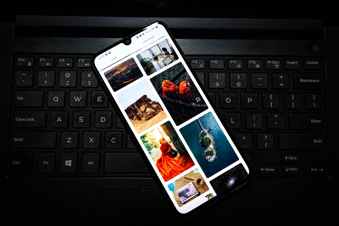
A slow image pipeline is the single most common reason a polished Bootstrap 5 site fails its Core Web Vitals assessment. Largest Contentful Paint (LCP) is dominated by images in roughly 70 % of real-world pages, according to HTTP Archive data for 2024. If your hero image loads at 3.8 seconds on a mid-range Android device on a 4G connection, no amount of CSS optimisation will rescue your Google Search ranking. The good news: Bootstrap 5 ships with utility classes and sensible defaults that, combined with a handful of HTML and build-tool techniques, can push LCP well under the 2.5-second “Good” threshold without a JavaScript framework in sight.
Key Takeaways
- Use
loading="lazy"on every below-the-fold image and never on the LCP hero image. - Pair Bootstrap’s
.img-fluidwithsrcsetandsizesto serve device-appropriate resolutions. - Convert images to WebP (with AVIF where browser support allows) and target sub-100 KB for hero assets.
- Set explicit
widthandheightattributes to eliminate Cumulative Layout Shift (CLS) caused by images. fetchpriority="high"on the LCP image tells the browser to fetch it before the preload scanner finishes parsing.- Canvas Template’s plugin stack handles lazy-loaded background images automatically via
data-bg, no custom JS required.
Why Images Dominate Core Web Vitals
Google’s Core Web Vitals suite measures three signals: Largest Contentful Paint (LCP), Cumulative Layout Shift (CLS), and Interaction to Next Paint (INP). Images affect all three. An unoptimised hero PNG inflates LCP. An image without declared dimensions causes layout shift as it loads. A carousel that downloads 20 full-resolution images on page load blocks the main thread and degrades INP. Understanding which metric each technique addresses stops you applying fixes in the wrong order.
Bootstrap 5.3 does not ship with any build-time image processing, that is intentional. The framework handles presentation; optimisation is your responsibility. This article fills that gap with concrete, implementable patterns.

Fix LCP: fetchpriority and No Lazy-Load on the Hero
The single highest-impact change you can make is ensuring the hero image is not lazy-loaded and is explicitly prioritised. The loading="lazy" attribute instructs the browser to defer the fetch, which is exactly what you do not want for an above-the-fold asset.
<!-- WRONG — never lazy-load the LCP image -->
<img
  src="hero.webp"
  class="img-fluid"
  loading="lazy"
  alt="Product hero"
>

<!-- CORRECT -->
<img
  src="hero-800.webp"
  srcset="hero-400.webp 400w, hero-800.webp 800w, hero-1600.webp 1600w"
  sizes="100vw"
  width="1600"
  height="900"
  class="img-fluid"
  fetchpriority="high"
  alt="Product hero"
>fetchpriority="high" (supported in Chrome 101+, Safari 17.2+, Firefox 132+) elevates the image’s network priority above other resources discovered at the same time. Combined with a <link rel="preload"> in <head>, this routinely shaves 300 to 700 ms off measured LCP on real devices.
<link
  rel="preload"
  as="image"
  href="hero-800.webp"
  imagesrcset="hero-400.webp 400w, hero-800.webp 800w, hero-1600.webp 1600w"
  imagesizes="100vw"
>Bootstrap’s img-fluid, srcset, and sizes
Bootstrap’s .img-fluid applies max-width: 100%; height: auto. It does nothing to select the correct source resolution, that is srcset‘s job. A common mistake is generating only one image size and relying on the browser to scale it down. A 1600-pixel-wide PNG served to a 375-pixel viewport wastes roughly 18× the bytes actually rendered.
A practical three-breakpoint set for a full-width hero:
- 400 w, phones in portrait (≤ 480 px viewport)
- 800 w, tablets and small laptops
- 1600 w, desktops and retina laptops at 2× density
For images inside Bootstrap’s grid (e.g., a .col-md-6 card image), adjust sizes accordingly:
<img
  src="card-600.webp"
  srcset="card-300.webp 300w, card-600.webp 600w, card-1200.webp 1200w"
  sizes="(max-width: 767px) 100vw, (max-width: 991px) 50vw, 33vw"
  width="600"
  height="400"
  class="img-fluid rounded"
  loading="lazy"
  alt="Feature card"
>If you are building image-heavy layouts, product grids, portfolios, or gallery sections, the pattern scales without modification. For a practical look at how image grids fit into a real template layout, see our post on 9 Bootstrap 5 Gallery Layouts for Photographers and Agencies.

Lazy-Loading Bootstrap Images Correctly
Native lazy-loading (loading="lazy") has been baseline-supported since 2022 across all major engines. There is no longer a strong case for JavaScript-based lazy loaders like lazysizes for standard <img> elements, the native implementation is faster, has no render-blocking overhead, and does not depend on IntersectionObserver polyfills.
Apply it to every image that is not visible in the initial viewport:
<img
  src="team-member.webp"
  width="400"
  height="400"
  class="img-fluid rounded-circle"
  loading="lazy"
  alt="Jane Smith, Lead Designer"
>Background images are the exception. CSS background-image properties are not covered by the loading attribute. The Canvas HTML Template handles this through its data-bg attribute pattern, processed by functions.bundle.js. Elements marked data-bg="url(image.webp)" only receive their background once they scroll into the viewport, eliminating eager-fetching of decorative section backgrounds that may never be seen.
<!-- Canvas background lazy-load pattern -->
<section
  class="section"
  data-bg="url(images/backgrounds/parallax-bg.webp)"
>
  <!-- content -->
</section>Eliminate CLS with Explicit Width and Height
Cumulative Layout Shift occurs when the browser allocates space for an image after the surrounding content has already been painted. The fix has been standard HTML since 2020: declare width and height attributes that match the image’s intrinsic dimensions. Modern browsers use these values to compute an aspect-ratio box before the image file arrives, so the layout never shifts.
<!-- Without dimensions — CLS risk -->
<img src="logo.png" class="img-fluid" alt="Brand logo">

<!-- With dimensions — CLS eliminated -->
<img src="logo.png" width="240" height="60" class="img-fluid" alt="Brand logo">Note that .img-fluid overrides the rendered size responsively, the width and height attributes are used only to establish the aspect ratio, not to fix pixel dimensions. You do not need to match the attribute values to the breakpoint-specific rendered size.
Bootstrap 5’s .ratio utility class provides an alternative for embedded media such as iframes and videos, but for <img> elements the attribute approach is always preferred.
Format, Compression, and Build-Tool Integration
Serving the right format is as important as lazy-loading. Target this hierarchy in 2025:
- AVIF, best compression, ~50 % smaller than WebP at equivalent quality. Supported by Chrome 85+, Firefox 113+, Safari 16+.
- WebP, near-universal support. Use as your primary format and AVIF as an enhancement.
- JPEG, fallback for legacy browsers and photographic content where WebP is unavailable.
Use <picture> to deliver AVIF with a WebP fallback:
<picture>
  <source
    type="image/avif"
    srcset="hero-800.avif 800w, hero-1600.avif 1600w"
    sizes="100vw"
  >
  <source
    type="image/webp"
    srcset="hero-800.webp 800w, hero-1600.webp 1600w"
    sizes="100vw"
  >
  <img
    src="hero-800.jpg"
    width="1600"
    height="900"
    class="img-fluid"
    fetchpriority="high"
    alt="Hero image"
  >
</picture>For build pipelines, Sharp (Node.js) is the industry standard for automated image conversion and resizing. Vite users can add vite-plugin-image-optimizer; webpack users can use image-minimizer-webpack-plugin with a Sharp adapter. If you are deploying to Netlify, the platform’s built-in image CDN handles on-the-fly format negotiation and resizing with zero build configuration, a convenient option covered in our guide on deploying a Bootstrap 5 HTML template to Netlify in 5 minutes.
Quality settings to start from: WebP at 80, AVIF at 65. Measure visually and adjust down until artefacts appear, then step back up by 5. Most photographic content is imperceptibly different at these settings compared to a full-quality source.
Audit and Measure Before You Ship
Applying these techniques without measuring is guesswork. Use the following tools before and after each change:
- Chrome DevTools → Performance panel: record a page load, click the LCP candidate in the waterfall, and confirm which element is triggering LCP and what its load time is.
- Lighthouse 12 (built into Chrome DevTools): generates an opportunities list sorted by estimated time savings. “Properly size images” and “Serve images in next-gen formats” are the two most commonly flagged.
- PageSpeed Insights: provides field data (Chrome User Experience Report) alongside lab data, so you can distinguish a lab score from real-user LCP on real devices.
- WebPageTest: filmstrip view shows exactly when images paint, which is invaluable for debugging above-the-fold issues.
A realistic target for a Bootstrap 5 marketing site: LCP under 2.5 s on mobile (simulated 4G, mid-tier device), CLS under 0.1, no images flagged as oversized in Lighthouse. These are achievable without a CDN if your build pipeline generates correct formats and dimensions, though a CDN compounds the gains significantly.
When you are building an image-heavy demo, a product landing page or ecommerce section, for example, the same audit loop applies. The patterns described here align directly with how Canvas Template structures its own demo pages, where image performance is a first-class concern from the initial build. If you want to see how image layouts integrate with a full template at the component level, the Canvas Ecommerce Demo: Product Grids and Cart Patterns post covers exactly that context.
Frequently Asked Questions
No. Bootstrap 5.3 provides layout utilities like .img-fluid and .img-thumbnail, but it does not add loading="lazy" automatically. You must add the attribute manually to each <img> element that appears below the fold. The Canvas Template’s functions.bundle.js extends this for CSS background images via the data-bg attribute pattern.
Do not lazy-load the first carousel slide’s image, it is almost always in the initial viewport and will be your LCP element. Apply loading="lazy" and optionally loading="eager" explicitly to the second and subsequent slides. Use fetchpriority="high" on the first slide’s image.
If you have a Node.js build step, install Sharp (npm install sharp) and write a short conversion script. For static projects without a build pipeline, the Squoosh CLI (npx @squoosh/cli) processes entire directories from the command line. Netlify’s image CDN is the lowest-friction option if you are already hosting there, it negotiates format automatically based on the Accept header.
Bootstrap’s .ratio utility uses a padding-top trick to create an aspect-ratio container, which prevents layout shift for iframes and embedded video. For standard <img> elements, .ratio is not appropriate, use explicit width and height attributes instead, which modern browsers use to infer the aspect ratio via the CSS aspect-ratio property.
Three sizes cover the majority of use cases for most images: a small variant for phones (around 400 px wide), a medium for tablets (around 800 px), and a large for desktop (1,600 px or the image’s natural maximum width, whichever is smaller). For very large hero images or galleries where quality is critical, add a 2,400 px variant for high-density desktop displays. Generating more than four sizes rarely produces measurable gains and increases build time and storage costs.
Looking for a production-ready Bootstrap 5 HTML template? Browse Canvas Template demos and find the perfect starting point for your next project.
If you’re building with the Canvas HTML Template and want to ship production-ready Bootstrap 5 layouts faster, try Canvas Builder free, the visual builder that exports clean Canvas-ready markup in minutes.
Skip the setup and build it free
Spin up a complete Bootstrap 5 site, blog included, with Canvas Builder. No coding, no cost.

Canvas Team
Tutorials and tips for building beautiful Bootstrap 5 websites with the Canvas HTML Template and Canvas Builder.
More from the Canvas Blog