

A landing page lives or dies by its structure. You can have the sharpest copy and the most polished visuals on the web, but if the sections are out of order, or missing entirely, visitors will bounce before they ever reach your call to action. Whether you are building from scratch or customising the Canvas HTML Template, understanding the anatomy of a high-converting Bootstrap landing page gives you a repeatable framework you can apply to every project. Below are the ten sections that belong in every serious landing page, along with practical markup you can drop straight into your workflow.
Key Takeaways
- A well-ordered landing page structure guides visitors through awareness, consideration, and decision without friction.
- Each section below has a distinct conversion job, removing any one of them creates a gap that costs you conversions.
- Bootstrap 5 utility classes make every section responsive with minimal custom CSS.
- Microinteractions and social proof blocks significantly lift trust signals on a Bootstrap landing page.
- Pre-built block libraries such as Canvas accelerate delivery while keeping code quality production-ready.
1. Hero Section
The hero is the first thing a visitor sees, and it must communicate your value proposition within three seconds. A strong hero contains a headline, a supporting subheadline, at least one primary CTA button, and a visual, either a product screenshot, illustration, or full-bleed image. In Bootstrap 5 the structure is straightforward:
<section class="py-6 bg-light">
  <div class="container">
    <div class="row align-items-center">
      <div class="col-lg-6">
        <h1 class="display-4 fw-bold">Ship Faster, Convert Better</h1>
        <p class="lead mt-3">The Bootstrap 5 landing page framework built for results.</p>
        <a href="#pricing" class="btn btn-primary btn-lg mt-4">Get Started Free</a>
      </div>
      <div class="col-lg-6">
        <img src="hero-visual.png" class="img-fluid rounded" alt="Product preview">
      </div>
    </div>
  </div>
</section>If you want to push the hero further with animated entrances and scroll-triggered effects, the post on microinteractions that make HTML templates feel premium is worth reading alongside this one.
2. Social Proof Bar
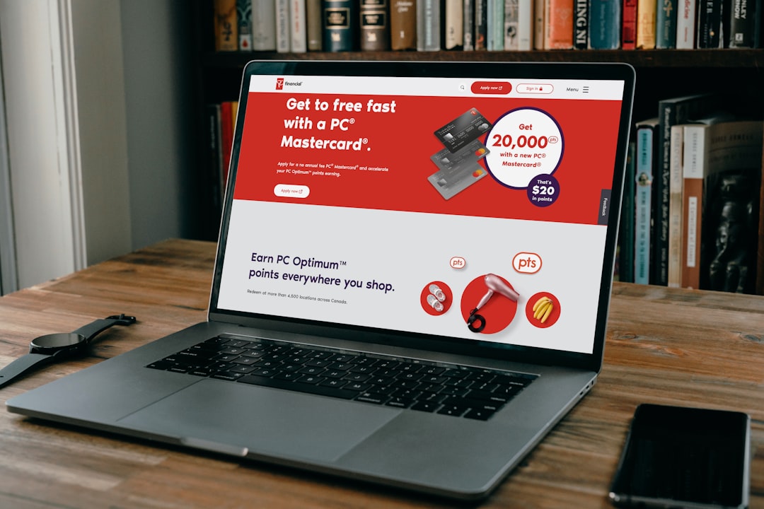
Immediately below the hero, a slim trust bar showing client logos, a star rating, or a single powerful statistic removes early scepticism before the visitor has even scrolled. Keep it one row, greyscale logos, and no more than six items. This is one of the highest-ROI sections on any landing page because it costs almost no vertical space yet dramatically reduces bounce intent.
3. Features and Benefits
Visitors do not buy features, they buy outcomes. Structure this section as a grid of icon cards where each card leads with the benefit and supports it with the feature. Bootstrap 5’s grid handles the responsive reflow automatically:
<section class="py-6" id="features">
  <div class="container">
    <div class="row g-4">
      <div class="col-md-4">
        <div class="p-4 border rounded h-100">
          <svg ...><!-- icon --></svg>
          <h3 class="h5 mt-3">Launch in Hours</h3>
          <p>Pre-built blocks mean you assemble, not build.</p>
        </div>
      </div>
      <!-- repeat for each feature -->
    </div>
  </div>
</section>Aim for three to six items. Fewer than three looks sparse; more than six overwhelms. Use consistent icon style, mixing filled and outlined icons in the same row erodes visual polish.
4. How It Works
A numbered step section reduces perceived complexity and is particularly important for SaaS, service, and onboarding-focused landing pages. Three to four steps with short action-oriented labels (“Sign Up”, “Connect Your Data”, “See Results”) work well. Use Bootstrap’s ordered list or a custom flex row with large step numbers styled via CSS custom properties such as --cnvs-themecolor if you are working inside Canvas.
5. Testimonials and Social Proof
By this point in the page, visitors have understood what you offer. Now they need to believe it. A dedicated testimonial section, not just a single quote, should include the reviewer’s name, photo, company, and a specific result rather than a generic compliment. Card carousels work well here on mobile, but ensure keyboard navigation is accessible. The Canvas template ships with ready-made testimonial block variations that handle this out of the box; there is a full breakdown of layout choices in the post on Canvas testimonial blocks for social proof that converts.
6. Pricing Section
Even if your pricing lives on a separate page, a landing page benefits from at least a simplified pricing summary or a “starting from” anchor. For SaaS or productised services, a three-column pricing table with a highlighted recommended tier is the standard that visitors expect. Make your most profitable tier visually prominent using a background colour, border, or badge:
<div class="col-md-4">
  <div class="p-4 border border-primary rounded text-center position-relative">
    <span class="badge bg-primary position-absolute top-0 start-50 translate-middle">
      Most Popular
    </span>
    <h3 class="h4">Pro</h3>
    <p class="display-5 fw-bold">$49<span class="fs-6 fw-normal">/mo</span></p>
    <ul class="list-unstyled mt-3 text-start">
      <li>✓ Unlimited projects</li>
      <li>✓ Priority support</li>
      <li>✓ Custom domain</li>
    </ul>
    <a href="#" class="btn btn-primary w-100 mt-3">Start Free Trial</a>
  </div>
</div>7. FAQ / Objection Handling
Every visitor who has not yet converted has at least one unresolved objection. An FAQ section surfaces and neutralises those objections before the visitor has to go looking for answers elsewhere. Write the questions in the visitor’s voice (“Will this work if I have no coding experience?”) rather than in your own (“What are the technical requirements?”). Use Bootstrap’s accordion component for compact display. Adding FAQ schema markup to this section also delivers SEO benefits, see the guide on adding schema markup to a Bootstrap 5 HTML template for implementation details.
8. Mid-Page and Secondary CTAs
Long landing pages need reinforcement CTAs, not just one at the top and one at the bottom. Place a secondary CTA after your features section and again after testimonials. These do not need to be full-width banners; a simple centred row with a heading and a button is enough. Vary the button label slightly to match where the visitor is in their consideration: “See It in Action” mid-page versus “Start Your Free Trial” near the bottom.
9. Contact or Newsletter Section
Not every visitor is ready to buy. A low-commitment contact form or email capture gives you a way to stay in the conversation. For lead-generation pages, this section is the primary conversion point. For product pages, it is a secondary net. Either way, keep the form to the minimum fields required, name and email is almost always enough at the landing page stage. Building this section well in Bootstrap 5, including responsive layout and newsletter integration, is covered in depth in the post on creating a responsive Bootstrap 5 footer with newsletter signup.
10. Sticky Navigation and Footer
Bookending the page with a sticky navbar that contains your primary CTA in the top-right corner means the call to action is always one click away, regardless of scroll depth. Pair this with a concise footer containing essential links, legal text, and social icons. The footer does not need to be complex, a three-column layout covering navigation, contact, and social handles is sufficient for a focused landing page. Keep the footer background dark or visually distinct so visitors know they have reached the end of the page.
Frequently Asked Questions
The most effective landing page structure follows the visitor’s natural decision journey: hero (awareness) → social proof bar (trust) → features and benefits (understanding) → how it works (confidence) → testimonials (belief) → pricing (decision) → FAQ (objection handling) → CTA (action) → contact (alternative path) → footer (closure). Adjusting this order for different audiences or offer types is fine, but this sequence provides a proven baseline.
Not always. Short-form landing pages for simple offers, a free download, a webinar signup, can omit pricing and how-it-works sections. However, for any paid product or service, all ten sections address a distinct visitor concern and removing them creates conversion gaps. Audit what you remove against the question: “Which objection does this section handle?”
Prioritise critical CSS inlining for above-the-fold sections, lazy-load all images below the fold, and use a minified JavaScript bundle rather than loading individual plugin files. Bootstrap 5’s utility-first approach also reduces the need for custom CSS, keeping stylesheet size manageable. Pre-built templates that ship with plugins.min.js and a well-optimised asset pipeline handle most of this by default.
Not necessarily. The hero CTA can use a high-intent label such as “Get Started Free” because some visitors arrive ready to act. Mid-page CTAs benefit from softer, lower-commitment language like “See a Live Demo” or “Explore Features” to convert visitors who are still in the consideration phase. Matching the label to the visitor’s mindset at each scroll depth consistently improves click-through rates.
A premium Bootstrap 5 template with pre-built section blocks is almost always the faster and more cost-effective choice. You get tested responsive layouts, accessibility-aware markup, and consistent design language out of the box. The effort shifts from building structure to customising content and branding, which is where your time is best spent. For agencies delivering multiple client sites, the speed advantage compounds significantly across projects.
Looking for a production-ready Bootstrap 5 HTML template? Browse Canvas Template demos and find the perfect starting point for your next project.
If you’re building with the Canvas HTML Template and want to ship production-ready Bootstrap 5 layouts faster, try Canvas Builder free, the visual builder that exports clean Canvas-ready markup in minutes.
Skip the setup and build it free
Spin up a complete Bootstrap 5 site, blog included, with Canvas Builder. No coding, no cost.

Canvas Team
Tutorials and tips for building beautiful Bootstrap 5 websites with the Canvas HTML Template and Canvas Builder.
More from the Canvas Blog