Shopping Cart

x 2

Light Blue Denim Dress
$24.99
x 3
$114.95
View Cart



A strong preview image draws readers in before they have read a single word. In this standard post we walk through choosing a featured photo, cropping it cleanly, sizing it for retina screens, and pairing it with a clear, confident headline so that every article on your blog earns the click it deserves from the very first scroll down the page.
Read MoreEmbedded video turns a quiet article into something readers actually finish. Here we show how to drop a responsive Vimeo player into any post, keep it looking sharp on phones and desktops, and let the clip carry the story while your words add the context around it.
Read More

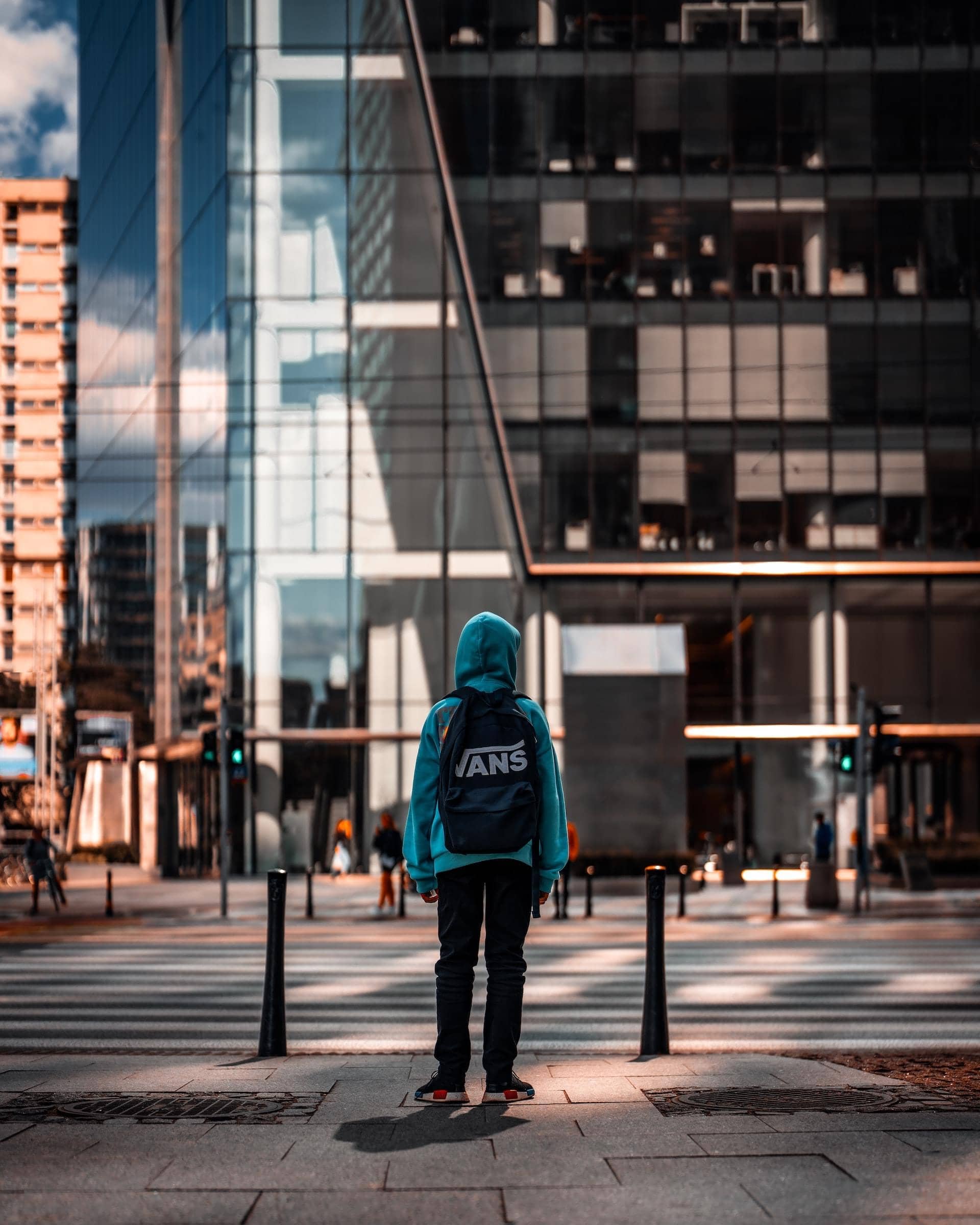
A slider gallery lets one post hold an entire shoot without overwhelming the page. In this example we line up three images in a touch-friendly carousel, add lightbox zoom for the curious, and keep load times quick so visitors can browse the whole set at their own pace.
Read More"When you are courting a nice girl an hour seems like a second. When you sit on a red-hot cinder a second seems like an hour. That's relativity."




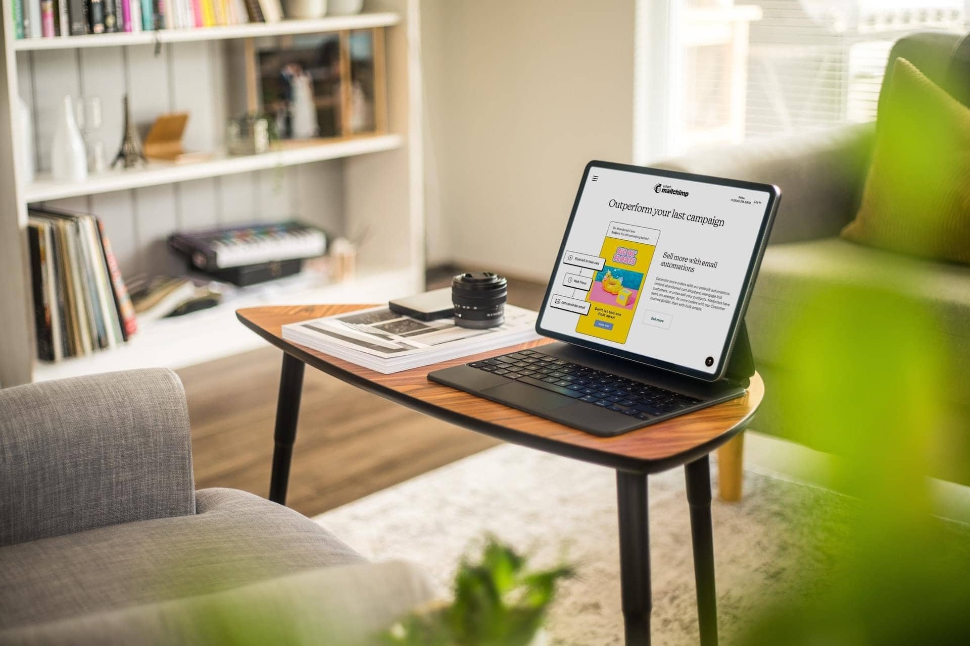
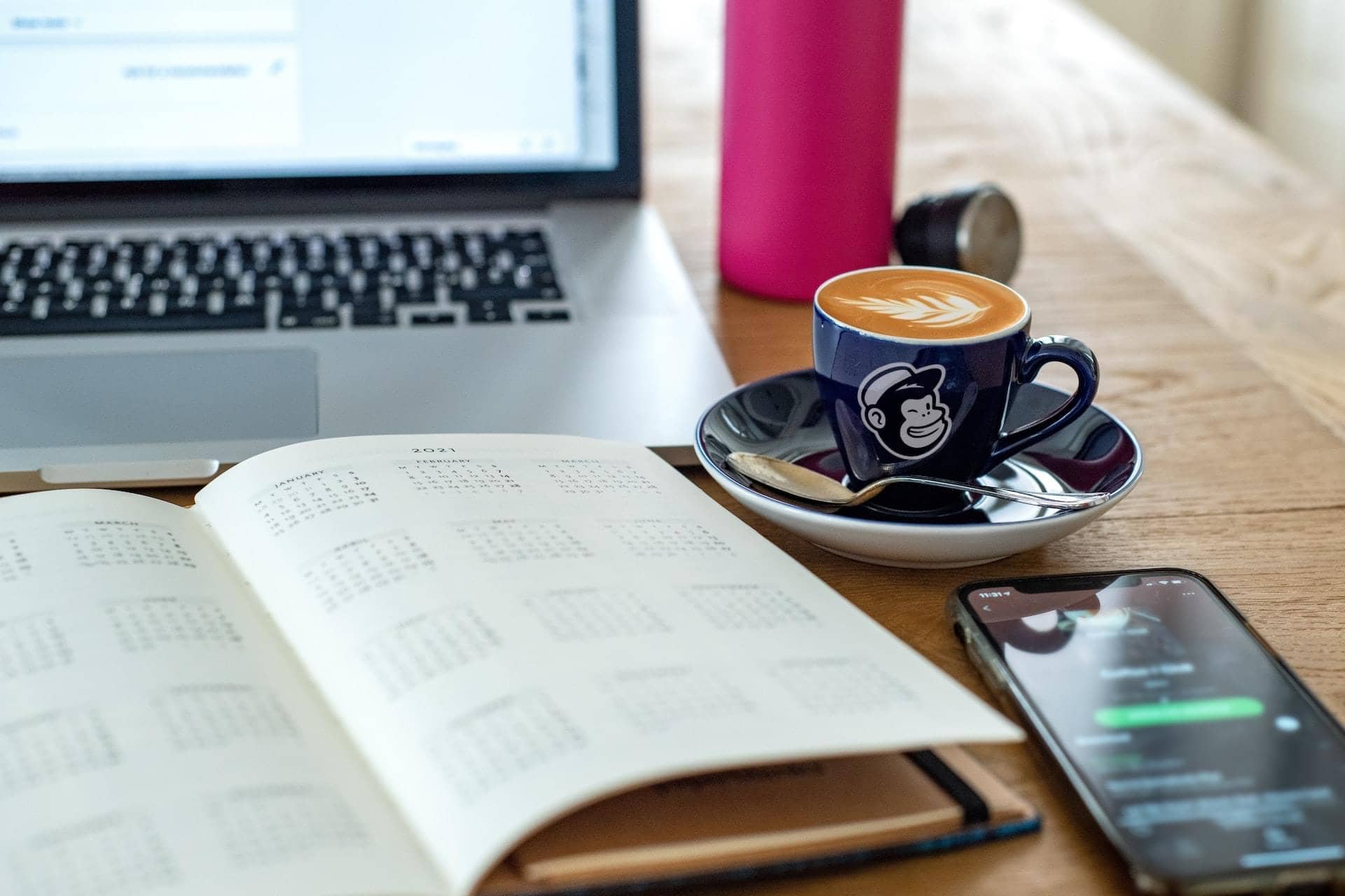
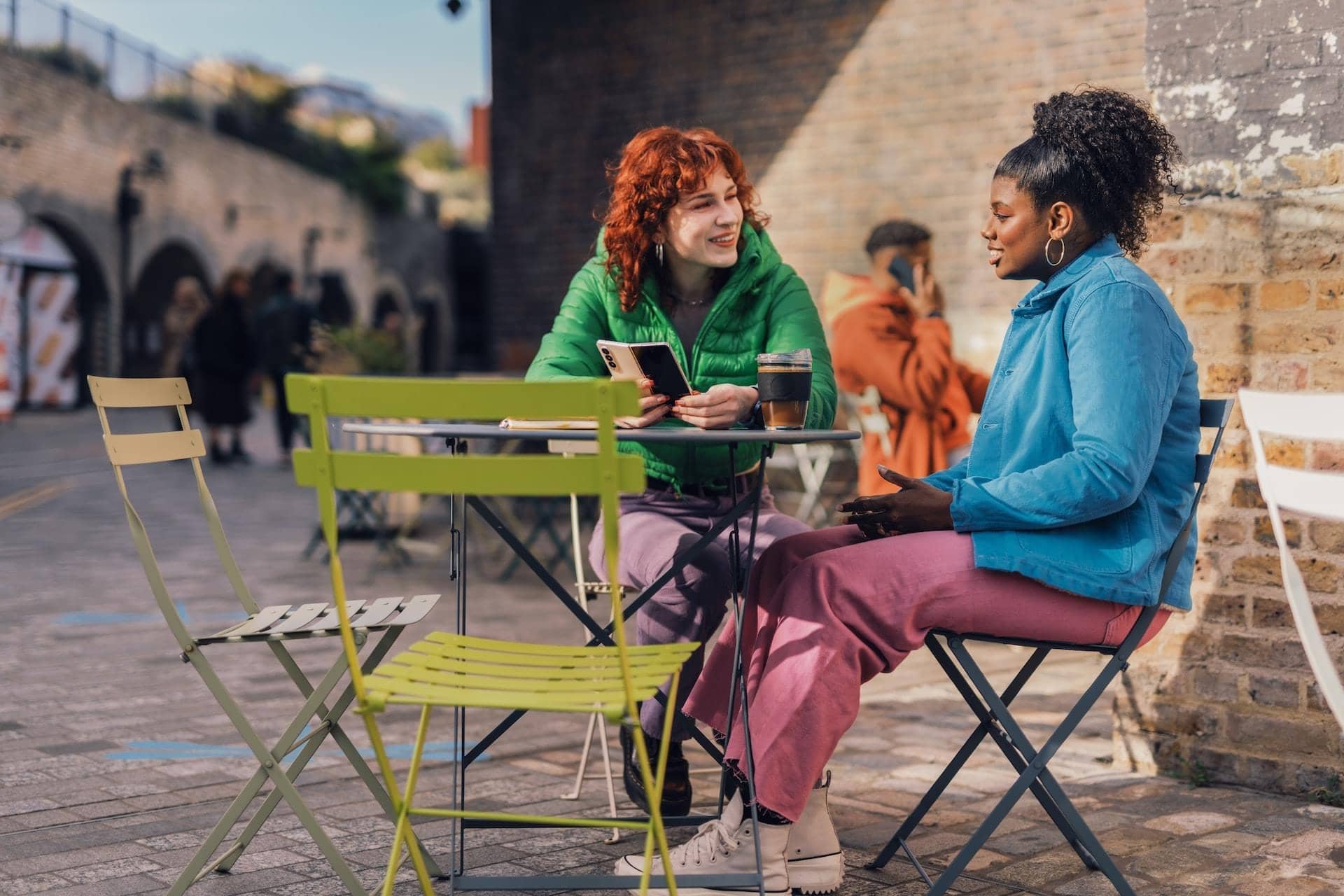


Masonry thumbnails pack a lot of visuals into a tidy grid that never feels crowded. This post shows how the layout balances different image sizes, opens each shot in a lightbox on tap, and keeps the focus squarely on your photography.
Read MoreEmbedded audio gives your blog a voice that text alone cannot match. This post features a SoundCloud player so readers can listen to an episode, a track, or a recorded interview right where they are, then keep scrolling through the rest of your latest stories.
Read More