Ultra Responsive Template
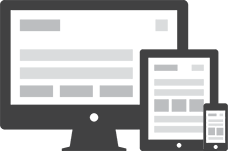
Canvas adapts flawlessly to every screen — from widescreen desktops to the smallest mobile devices. The fluid grid system, flexible images, and CSS media queries ensure your content always looks polished and pixel-perfect. Whether visitors browse on a phone, tablet, or desktop monitor, Canvas delivers a consistent, professional experience without extra configuration. Every breakpoint is carefully tuned so navigation, imagery, and typography all scale in perfect proportion.
Retina Ready Display
Canvas is fully optimized for high-density Retina and HiDPI displays, ensuring every visual element appears sharp and refined on any screen. All bundled icons are delivered as scalable vector fonts, which scale losslessly at any size and pixel density without blurring. Images throughout the template are carefully exported at 2x resolution with proper srcset declarations, so Retina MacBooks, iPhones, and Android flagship devices all render artwork at the highest possible fidelity. Typography is handled via Google Web Fonts with sub-pixel rendering enabled, eliminating jagged edges even at small sizes on ultra-sharp displays. The entire icon set — from navigation controls to feature-box glyphs — uses pure CSS vector rendering, guaranteeing stunning clarity on screens up to 4K resolution. Whether visitors arrive on an aging laptop or the latest OLED smartphone, Canvas ensures your brand always looks its absolute best without requiring manual image swapping, server-side detection, or complex configuration. Every detail has been meticulously considered, from logo assets to UI micro-interactions, so you can confidently present a premium visual experience to every visitor across every device class and screen resolution, today and as display technology continues to advance.
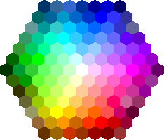
Unlimited Color Options
Canvas provides a virtually unlimited palette for customizing your site's color scheme. A single 6-digit HEX value in the color configuration file instantly updates primary buttons, links, headings, section backgrounds, and interactive highlights across every page. No CSS expertise required — the cascading variable system propagates your brand color automatically. Whether you need a bold cobalt blue for a technology firm, a warm terracotta for a hospitality brand, or a high-contrast monochrome palette for editorial content, Canvas accommodates it without touching a single template file. Gradient options, per-section accent overrides, and a built-in dark-mode toggle give designers granular control while keeping the implementation clean and maintainable. Clients can preview and switch color themes in seconds, making Canvas an ideal starting point for agencies managing multiple brand identities simultaneously.
Bootstrap v3.2.0 Compatiable
Canvas is built on the solid foundation of Bootstrap, taking full advantage of its responsive grid, pre-built components, and extensive utility classes. Every Canvas element — from navigation bars and modal dialogs to form controls and progress indicators — integrates seamlessly with Bootstrap conventions. This ensures that third-party Bootstrap plugins, UI kits, and custom components you add to your project will slot in without conflicts or style overrides. Developers already familiar with Bootstrap can extend and customize Canvas immediately, without climbing a steep learning curve.
Light & Dark Scheme Available
Canvas ships with both a pristine light color scheme and a sleek dark mode, giving you the flexibility to match any brand aesthetic or user preference. Toggling between the two requires nothing more than a CSS class swap, making it trivial to offer a user-controlled mode switcher on your live site. The light scheme is crisp and airy — ideal for corporate, editorial, and e-commerce contexts where legibility and professionalism are paramount. The dark scheme is bold and modern, tailor-made for agencies, software products, and creative portfolios that want visual impact and a premium feel. Both schemes are implemented using CSS custom properties, so your brand accent color updates instantly across whichever mode is active. Section-level overrides allow you to mix schemes within a single page — a dark hero section with a light content area is just a class attribute away. Accessibility contrast ratios are maintained in both modes, ensuring compliance with WCAG guidelines and an inclusive experience for all visitors regardless of their visual environment or system preferences.

