Ultra Responsive Template
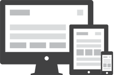
Canvas adapts fluidly to every screen size, from wide desktops down to the smallest phones, so your content always looks pixel perfect. Built on a flexible grid, sections reflow automatically with no extra effort from you. Columns stack, images scale, and typography adjusts to stay readable. A single codebase serves every visitor a fast, polished experience, whether they arrive on a widescreen monitor, a tablet in portrait mode, or a phone on the go. No separate mobile site to maintain, and no compromise on quality.
Retina Ready Display
Every graphic, icon, and interface element in Canvas is crafted to look razor sharp on high-density Retina and HiDPI screens. We ship double-resolution image assets and rely on scalable vector icons wherever possible, so edges stay crisp and text never appears soft or blurry. The result is a premium, professional finish that holds up beautifully on the latest laptops, tablets, and smartphones, the very devices your audience uses most. Because the assets are served responsively, standard screens download lighter versions while Retina screens automatically request the higher-resolution set, keeping page weight in check without sacrificing clarity. This attention to detail extends across the entire template, from hero sliders and feature boxes to buttons, badges, and the smallest decorative flourishes. You will not need to commission custom artwork or fiddle with pixel ratios yourself, since the system handles the heavy lifting for you. The outcome is a website that feels modern and meticulously polished, instantly signalling quality to visitors and reinforcing trust in your brand from the very first glance. Whether your audience views the site on a flagship phone, a high-resolution tablet, or a 5K studio display, the presentation stays consistently sharp, clean, and dependable across every page they open today.
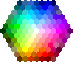
Unlimited Color Options
Recolor the entire template in seconds without touching a line of core code. Canvas drives its palette from a small set of CSS variables, so changing your primary accent, link tones, and highlight shades is as simple as editing one value. Every button, badge, border, and hover state updates in unison, keeping the design consistent throughout. Prefer a calm blue, a bold red, or an earthy green? Just pick a hue and watch it ripple across the whole site instantly. Bundled color schemes give you a head start, and you can save your own custom presets to reuse across future projects with ease. This flexibility lets agencies and freelancers match almost any brand guideline quickly, delivering a tailored, on-brand look for each client without the usual hours of tedious manual restyling or hunting through stylesheets.
Bootstrap v3.2.0 Compatiable
Canvas is built on the rock-solid Bootstrap framework, so you inherit a battle-tested, responsive grid and a vast library of familiar components right out of the box. Developers who already know Bootstrap will feel at home immediately, reusing its classes, utilities, and conventions without a learning curve. That compatibility also means easier maintenance, smoother third-party plugin integration, and confidence that your layout behaves predictably across every modern browser and device you need to support today.
Light & Dark Scheme Available
Offer your visitors a comfortable viewing experience in any lighting condition with built-in light and dark color schemes. Canvas ships with a polished dark mode that recolors backgrounds, text, borders, and components for low-light environments, reducing eye strain during late-night browsing. Switching between the two is effortless, and you can even let the page respect each visitor's system preference automatically, so returning users land in the mode they expect. Both schemes are carefully tuned for contrast and accessibility, ensuring headings, body copy, and interactive elements remain legible and inviting whichever theme is active. Because the styling flows from shared variables, your custom accent colors carry through to dark mode without extra work, keeping your brand identity intact. This dual-scheme support is increasingly expected by modern audiences, and Canvas delivers it cleanly so you can launch a contemporary, considerate site that feels right at any hour of the day, on any device, without writing additional styling code yourself or maintaining two separate stylesheets.

