Shopping Cart

x 2

Light Blue Denim Dress
$24.99
x 3
$114.95
View Cart
Powerful Layout with Responsive functionality that can be adapted to any screen size. Resize browser to view.

Looks beautiful & ultra-sharp on Retina Screen Displays. Retina Icons, Fonts & all others graphics are optimized.

Canvas includes tons of optimized code that are completely customizable and deliver unmatched fast performance.
Canvas adapts effortlessly as your product grows, letting you build anything from a lean MVP to a feature-rich platform without switching frameworks.
With modular components and a flexible grid system, every part of your interface scales predictably. Developers and designers can collaborate on the same codebase with ease and confidence.
Start Trial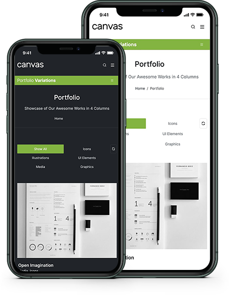
Every screen size receives a thoughtfully optimized layout, from compact smartphones to widescreen monitors. Navigation reflows smoothly, images scale within their containers, and touch targets stay comfortably accessible. Whether your audience uses an iPhone, tablet, or laptop, the experience is consistently sharp and polished.
View GalleryPowerful Layout with Responsive functionality that can be adapted to any screen size. Resize browser to view.
Looks beautiful & ultra-sharp on Retina Screen Displays. Retina Icons, Fonts & all others graphics are optimized.
Canvas includes tons of optimized code that are completely customizable and deliver unmatched fast performance.
We have included 12+ Header + Menu Designs for your convenience so that you can match your style.
Completely Customizable 2 Columns, 3 Columns, 4 Columns & 5 Columns Mega Menus are available with Canvas.
Smooth & Stylish Sticky Menu is what will make your Website differentiate with others.

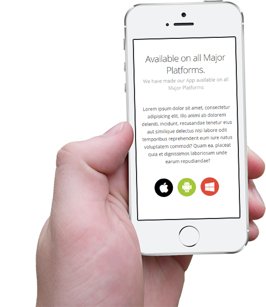
Download once, run everywhere. Canvas delivers native-quality experiences to the iOS App Store, Google Play, and the Microsoft Store from a single unified codebase. Push updates simultaneously across all platforms, maintain consistent branding, and reach millions of users without separate teams for each operating system.